Hey guys! This is Chris, in this post I am going to show you how I created my GOT Network Diagram. It took a lot of thought (and trial and error) at the beginning, but once I understood the process and the concepts it was very easy to achieve! Let me walk you through the steps I took and lets have some fun with Tableau!

Ever since seeing Sebastián Soto Vera’s (@SSotoV) viz called ‘THE #MAKEOVERMONDAY NET’ and then Seffana Mohamed – Ajaz’s (@SeffanaAjaz) viz called ‘The Marvel Cinematic Universe Network’ I wanted to try and create my very own network graph…but how?
A quick google search lead me to a couple Tableau community resources that didn’t really point me in the right direction. So, I went back and downloaded their workbooks and started looking at the underlying data structure.
The first thing to do was trying to find a data set that would be able to show a network of relationships – It just so happened that the #MakeoverMonday 2019 Week 27 data was The Game of Thrones Deaths. This data turned out to be a good starting point since it had the Killer’s name and the Victim’s name along with additional information, such as: the location of the death, the killer’s house, season & episode of the death, etc. The data was compiled and shared by David Murphy (@Datasaurus-Rex).

As you can see, the Killer’s name repeats because they have killed multiple people. Also, some of the Victim’s names such as Tribesman are not unique and are repeated for multiple killers. This is due to a vague name like Tribesman. Here, you have one of two options that will allow you to prep the data accordingly:
- Create a distinct naming convention for the duplicate victims (the route I chose to take). This will show each individual death within the show.
- Remove the duplicate victim names. This will show the connection between the killers and common victims. Using the example above, it would show one dot (node) which represents the Tribesman (the victim) and a single node for Bronn, Rodrick, and Tyrion that are all connected to the Tribesman.
After you’ve decided the avenue you wish to take, then it’s time to get the data prepared. Before we prep the data, we need to understand how to set it up. We’ll be using a program called Gephi to create the network graph. We need to create two .csv files; one called ‘Nodes’ the other called ‘Edges’ in order for Gephi to work its magic.
Creating Nodes:

Let’s create the nodes file first. The columns need to be named ID, Nodes, and Label as seen in the photo above. Next, let’s take the names listed in the Killer column from the original data set and copy / paste them under the Label column.
Next, go to the [Data] tab in Excel and look for the Data Tools section. Here, click on the ‘Remove Duplicates’ button to remove all the duplicate names from the list.

At this point, you should have a message box pop up letting you know the amount of unique values remaining. If you’ve already decided on the avenue you wish to take by either giving the duplicate Victim’s unique names or not, we need to copy / paste this list of names in the same Label column as we did the Killers. Again, let’s remove all the duplicates. Now, we just need to create a unique ID and Node for each value in the Label column. This can easily be done by starting at B2 and inputting the number 1.

Then double click on the green square in the bottom-right corner of the cell. This will auto copy all the way down the rows. Click on the square in the bottom-right again, and select ‘Fill Series’.
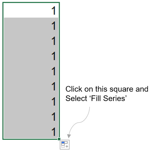
The last thing we have to do for the Nodes.csv file is to copy the unique numbers we just generated and paste them into the ID column. Essentially, both the ID and Node columns need to be identical. Then, save the sheet as a .csv file and name it Node. Now let’s get ready to get the Edges file ready!

Creating Edges:

Let’s use Excel’s Index / Match function to get those unique ID’s back into the original dataset for both the killer and victim. So, what I decided to do was to create two new columns back in the original data; ‘Source’ and ‘Target’ – see photo above. More information on Index /Match can be found here: https://www.deskbright.com/excel/using-index-match/

Once all the ID’s have been indexed back to the original dataset, we can now create the Edges.csv file. All you have to do is create a new sheet in Excel and create four columns named; Source, Target, Type, and Weight. Here, just copy / paste the source and target columns you just created. Next, have ‘Directed’ going all the way down in the Type column and 1 as the Weight. You can read more about this on Gephi’s website and other google searches. You should have something that looks like the photo above at this point. Now, just save this sheet out as a .csv file and name it Edges.
After the Excel workbooks are completed, we have the data we want to use for this type of visualization…so how do we start?
Let’s download Gephi and install it on our computer. You can download the free program here: https://gephi.org/ If you’ve installed it and get an error saying something like: ‘Error: Cannot find Java 1.8 or higher’ then check this site out to help you fix it (I had to do this): https://github.com/gephi/gephi/issues/1787
Ok, once that’s all completed and Gehpi loads properly, how do we load the data into it?
Loading Data into Gephi:
File -> Open: Open the Nodes.csv and Gehpi should automatically recognize that it’s a nodes table. Click next, finish and then select ‘Directed’ from the graph type dropdown. Do the same thing with Edges.csv but after selecting ‘Directed’ also click ‘Append to existing workspace’ from the radio buttons for the Edge file.
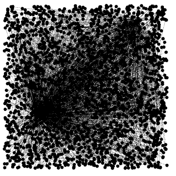
You should have something that looks like the photo above – a complete mess. Now, it’s time to start playing with the layouts and running the algorithms.

Using the drop down that says ‘Choose a layout’, you can start playing around with the different layouts and algorithms. More information can be found here: https://gephi.org/users/

After trial and error along with reading the how-to information you should have your first network graph similar to the photo above. That’s all well and good, but how do we extract the X and Y coordinates?
Well, it’s easier than you’d probably expect. We need to export the data as a graph file.

In order to export the graph file, go to File -> Export -> Graph File and save it as a .gexf file. Essentially, the file format is XML. You can open the .gexf file in any text editor like notepad or Sublime Text.
The photo below shows the file opened in Sublime Text. You’ll notice the file has the bode ID and label string field along with the different statistics you ran within Gephi and below that you’ll see the X and Y coordinates. Now we need to extract them out and join it back to our data.

An easy way to extract the data out of the XML file is to open the .gexf file in Excel. Open Excel and select the option to Open. In order to see the file, you’ll need to change the option to search for all file types and then search for the file and click open. You will get a warning message right away but just click ok.

After that, another message box will pop-up asking how you want to treat the XML file. Just select the option to open it ‘As an XML Table’ (photo above) click ok again and voila – there is all the data from the graph file.
There are a few rows and columns that are not needed so we can eliminate them. Rows 2-14 and Columns A through L can all be deleted. Now it’s time to Index/Match the data from the graph file back to the original data set and the nodes file.
There are a couple things we need to do to finish the data prep. One is to create a column named ‘Direction’ with a simple calculation which is just a concatenation. The Excel function you can use to create this new field value is =[Killer]&”->”&[Victim Name] and the value returned should be something like ‘Bronn -> Baratheon of Dragonstone soldier’. Apply the function down the rows and then copy and paste as values. The last thing we need to do is to make a complete copy of the data and paste it below the original dataset with a row separating the two copies. With the second copy, just replace the Killer’s names with the Victim’s names and vice versa. Delete the row separating the two copies and we are ready for Tableau!
Tableau Time:

Time to bring the data into Tableau and join the Nodes table to the main data by the ID field. This will get the coordinates joined so now we can start building the network graph.

Take the X and Y measures and place them on your Rows and Columns shelves and turn them into dimensions. Dual axis your Y dimension and synchronize the axis.

You should have something that looks like the photo above if you’ve done this step correctly. How do we show the edges that connect the nodes? Easy, remember the [Direction] field we created in the data prep? Time to see why we took that extra step.
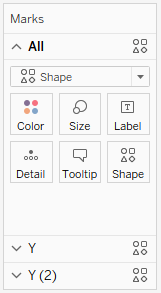
This should be your default Marks Shelf settings so far (first photo).

Let’s click to open the first [Y] shelf and change it to a line chart (second photo) and you should get what looks like static on the screen.

Place the [Direction] dimension on the details shelf and check out the network graph you just created!
Play around with your formatting and overall look of the design but most importantly, have fun! Below is a photo of how it should look if you’ve followed the process to this point.

And that’s how easy it was to create this Network diagram! There was a lot of thought put into it but I hope this post can make it easier for all of you! As always, if you have any questions feel free to send us a message.
This is how I created the GoT Network Diagram. Remember to make it your own, you can use the above steps to create any type of Network Graph, it’s just a little time consuming to prep the data but once it gets into Tableau the fun begins! Until our next post!!

Surf on and Keep Vizzin’!
The Data Surfers.

Nice article! I still feel like I need to address a specific point, though. Network maps are isotropic visualizations, which means that the X and Y scales must be the same. In other words, the visualization must not be stretched. Gephi knows, but Tableau does not, so you must do it manually. Stretched network maps are biased, see https://reticular.hypotheses.org/849
Out of that, thanks for the contribution 🙂
LikeLiked by 2 people
Hello Mathieu,
Thank you very much for the information about stretched network maps! I’ll make an edit to the blog post to include this information and stress the importance of this point.
Thanks Again!
-Chris Conn
LikeLiked by 1 person
So this method won’t create directional lines (ie . with arrow marks) on the diagram. Do you have any advice for adding arrows, or examples where it had been done? I did find this post which discusses adding them to a map: https://konstantingreger.net/giving-your-flows-a-direction-in-tableau/. Cheers, Reed.
LikeLiked by 2 people
Hello Reed, I hadn’t thought of it before but I like your idea. I looked that post you shared and that will work for what you need. I also found this article which I think would have better performance in Tableau since it’s not calculating anything. https://mapattack.wordpress.com/2017/03/19/adding-arrowheads-in-a-route/
Let us know if it helps out! I think I’m going to try it with my connected world viz
LikeLiked by 1 person
I’ve done the Konstantin Gregor method. This one doesn’t look as clean, although may be easier for map paths than scatterplot approach.
LikeLiked by 1 person
Can you send a pic to thedatasurfers@gmail.com? I’m curious of how it turned out!! We haven’t had time to try it out yet.
– Christopher
LikeLike
great work, let me ask you, what layout output you choosed? did you change it parameters?
LikeLiked by 1 person
Morning all, I was able to replicate your step by step, the only thing is on that part here “Place the [Direction] dimension on the details shelf and check out the network graph you just created!” I´m not able to see the network graph, only dots even with lines selected on the first [Y] shelf.I´already did everything a couple of times again (to became more clear on my mind), with no success.
I´m stuck on that part , can anyone help me please.?
LikeLike
Hi! Thanks for the tutorial. I am having trouble following the Index Match step. How are the numbers in the source and target column generated.
Can you please elaborate this step.
LikeLike
For the part on creating edges, I only used ‘Match’ to map the numbers over. For the 2nd part, you can scroll down further in the link he has provided, it shows a formula with a ‘Match’ formula inside a ‘Index’ formula. I used it on another dataset and it works.
LikeLike
Hi, can you please explain the step where we have to use INDEX / MATCH function to generate unique IDs.
Thanks for the guide!
LikeLike
I’m trying to follow this using another dataset and I’m getting very lost when you say ‘There are a few rows and columns that are not needed so we can eliminate them. Rows 2-14 and Columns A through L can all be deleted.’
I can see that Columns A through L are ‘version’ to ‘id3’ but what do Rows 2-14 represent? I see three separate tables here in my Excel file. Columns A through L is the first,
the second is: nodes with values, x, y and colour
the third is: source, target, weight, and colour
I don’t know if this is due to the fact that I have an additional error that is not mentioned in your post: XML Error (when opening the file on Excel)
“An XML error has occurred. Please correct the problem and try again. Click OK to have Excel create a schema based on the XML source data.”
Could you please advise?
LikeLike