For this post, we decided to concentrate on the Sankey Bump Chart. This was one of Chris’ first experiments on trying his luck at Tableau solo. It took him a little while to figure the calculations but with all the help of the Tableau community this was possible.
After Chris finished this chart we thought it would be pretty cool if he did a step by step. The original thought was that if he made the step by step it would be easier for me to learn the details that were involved in creating the chart. I am more comfortable in creating and sketching the dashboard designs and I am still learning the calculations so a step by step was definitely needed. At the same time, we wanted to give back to the Tableau community that has helped Chris and I so much in this Tableau journey and we figured that if I can learn from it then why not share it with our Tableau enthusiasts.
To see Chris’ interactive dashboard click here.
So, let’s get started!!

The first step in creating the Sankey Bump Chart is Data Prep – data prep is the main and most important part of the process – you can do this in Excel or SQL.
You’ll want to create an extra column in your Excel spreadsheet called [Link] and just copy that down the entire column in the workbook of your underlying data.
On another sheet, create the same [Link] column and another column next to it named [Path] with the numbers running down from 1 to 49. In the end, both of your Excel spreadsheets will look like the screenshot below.


The next step would be uploading the data to Tableau and connecting both Excel spreadsheets. To connect both spreadsheets you will need to do a join. The join does not have to be a Full Outer join, an Inner join would work for this type of chart as well.

After both Excel spreadsheets are joined, it’s time to being making the calculations!! Chris thought that the best idea would be to list them in the order needed as many of them are nested calculations. There’s a total of 21 calculations in this chart.
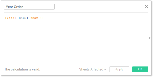
The first calculation is the [Year Order] calculation:
Followed by the [Path Order] calculation:

[T] calculation:

[Year Fake] calculation:

[Lookup Value] calculation:

[Lookup Rank] calculation:
![]()
[Rank] calculation:
![]()
[Rank 1] calculation:
![]()
[Rank 2 Setup] calculation:
![]()
[Rank 2] calculation:
![]()
[Sigmoid] calculation:

[Sort Order] calculation:

[Curve] calculation:

[Curve 2] calculation:

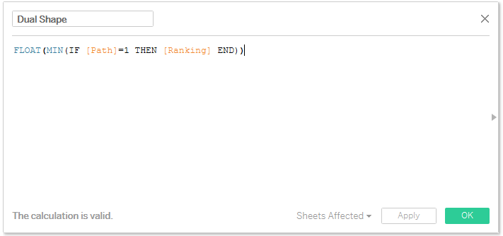
[Dual Shape] calculation:
[First Value] calculation:

[Last Value] calculation:

[Real Lookup Rank] calculation:

[Change] calculation:

[Label End] calculation:

And Lastly, the [Label Start] calculation:

Now that we have all 21 calculations created, let’s start creating our Viz!!
The first thing to do is to take the [Year Fake] pill and put it on the columns shelf as continuous dimension.

Then, take the [Location] and [Year] pills and put them on the Marks section under detail. Take the [Curve] pill and place it on the rows shelf.

This is what you should have up to this point.
If your Tableau sheets looks exactly as the above then you’re on the right track! Now, let’s go edit the [Curve] calculation!
 \
\
Important Note!! When editing this table calculation, make sure the dimensions are in the same order as Chris’ example below. Also, see how the calculations are restarting on different dimensions? Make sure you choose Rank 2 Setup instead of Rank 2 for this calculation.


At this point, the sheet you’re working on should look like this:

It’s starting to look a lot like a Sankey Bump Chart, isn’t it?!?! So exciting!! Let’s keep moving!
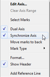
The next step is to take our [Dual Shape] pill and place it next to the [Curve] pill on the rows shelf. Click on the drop down belonging to the [Dual Shape] pill, make it a dual axis and synchronize it.

This is what you should see on your sheet!

Now is where things get a little bit tricky. The next step is to reverse the axis of [Curve]. To get to the below screenshot, click on the axis belonging to the [Curve] pill, right click and select edit axis. After the pop up pops click on reverse and then click OK.

Next, we should start working on excluding the outermost “dots” that are showing on the right-hand side of your chart. To achieve it, just select the outermost “dots” and then exclude them.


After you exclude the outermost “dots”, your chart should look like the below.

Now that we have the calculations out of the way, it’s time for formatting!! Great job guys, we’re almost done!!!
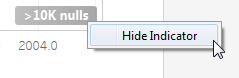
To start formatting our chart we have to first hide the null indicator, edit the axis to create more space for the state labels, and hide the [Year Fake] header.
To hide the null indicator – Click on the >10K Nulls indicator and select Hide Indicator.
To edit the axis to create more space for the stat labels – Click on the axis belonging to the [Year Fake] pill and click on edit axis. Once the window pops, make sure the range is fixed and then change the second dropdown to Fixed End, on the cell right below type the last number that is shown on the axis, in this case it would be 2004.8

To hide the [Year Fake] header – Click on the dropdown belonging to the [Year Fake] pill and click on show header. There will be a check mark next to it if the header shows on your chart, once there is no check mark next to it then the header will not show up.

Next, we need to format [Dual Shape] and change the shape to a circle. Once done, increase the size of the circle. Now, take [Ranking] onto color and place it for both the line and circle.

Take the [Label Start] pill and place it on Label under the line shelf on Marks, then click on labels to open the pop up window. Once the window is up, change alignment to right, then edit the text box by putting six or seven spaces in front of the text to give it extra space.

The result of the formatting we just did should be seen in tableau like this:

We have two more steps and we’re done!!
Now, take the [Ranking] pill and place that on Label under the circle shelf on Marks. Click on Label and change alignment to middle center to make the ranking centered.

And this is our LAST step you guys!!!
Lastly, we need to create the actions. Click on the Worksheet tab and go to Actions… Once the window pops up click on the button that says Add Action on the bottom left corner and select “highlight…”
The new pop up window title will say “Edit Highlight Action.” On source sheets select the dashboard, click on hover and make sure the Bump option is checked off on the top and bottom. The target highlighting should be marked on selected fields and lastly Location on the bottom right corner of the pop up should also be checked off. If yours looks exactly like Chris’ below, just click OK and you will be all good!!

And VOILA!! Congratulations on making your first Sankey Bump Chart!!!!

This chart was very fun to make! Chris was very excited when it was completed and as soon as we got home from work I got a full-on lecture on Sankey Bump Charts. Of course, I had no idea what he was talking about until Tableau was up and I was looking at the final product.
We also had a lot of fun making this post and re-doing the Sankey Bump Chart. We hope you guys enjoy it as much as we did!!
As always, if you guys have any questions please do not hesitate to contact us. Chris and I will be more than happy to help!!
Surf on and Keep Vizzin’!!
The Data Surfers.
