Hey guys! After a good while we finally came around to creating this post! We had a lot of things happen since we wanted to start this and things are finally calming down for us, so here you go! We used this design to complete one of the Makeover Mondays using data about the Dietary Preferences Around the World. In this blog post we will show you how this dashboard was put together plus we will give you a couple of Tableau design best practices tips for a simple and clean design!
To see the interactive visualization in Tableau Public click here.

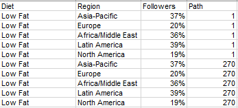
First comes first, we need to make sure our data is properly set up. Your original data will look like the below worksheet but make sure you have all the rows (56 of them).

To start setting up the “skeleton” for the ring chart you need to create an extra column called “Path”. Then, you will need to duplicate the data; for the first set “Path” will be 1 and for the second it will be 270 – this indicates the degrees the rings are to follow. Please refer to the example below, you need the same set up for each kind of diet type.
Now that you have the worksheet done it’s time to save and load it in Tableau!
The first steps are to create the calculations, here we will have 11 calculations so let’s get going!
Calculations:
Color

Index

Pi

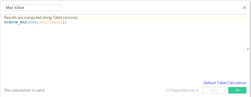
Max Value
Value (Windows Sum)

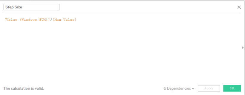
Step Size
Color Test

Rank

X

Y

And finally, our last calculation:
AF Color

The last thing we have to do is create a Bin from the Path measure. To do this click on the drop-down from the Path pill, hover over create and select “Bins…”

Once you click on “Bins…“, if the Range of Values “Min” and “Max” are blank, just click on “Suggest Bin Size” and Tableau will automatically fill in those values, but make sure that you erase the automatic value it puts on “Size of Bins” and change it to 1.
Your window should look like this:
Then just click OK and now were done with all the calculations needed! Let’s start creating our ring chart!
First, we need to set everything up on the Marks card because we will be working with table calculations.
- Bring Region and Diet to Color
- Value (Windows SUM) and Diet to Label
- From the drop-down on the Marks card select Line
- And then bring Path (bin) to Path

Then, select the Y pill and bring it to Columns, click on the drop-down and go down to Compute Using and select Path (bin).

Now bring the X pill onto Rows and do the same thing. Click on the drop-down, go down to Compute Using and select Path (bin).

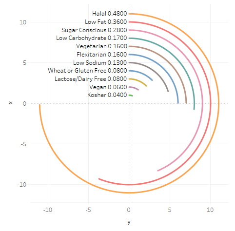
You should come up with the below pattern:

Now we need to update the table calculations on both the X and Y axis
First go to the Y axis pill, click on the drop-down and select “Edit Table Calculation…”

When the new window pops up click on the drop-down under “Nested Calculations” and select Max Value, under “Compute Using” select Specific Dimensions click on Path (bin) and Diet and bring Path (bin) to top. On “At the level” select Deepest. Tableau will save this automatically.
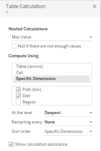
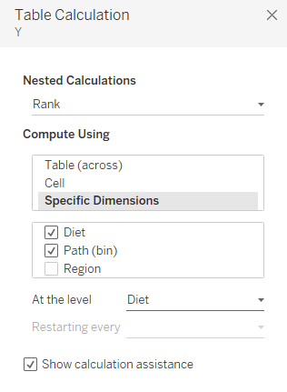
Now click on the same drop-down under “Nested Calculations” and select Rank, under “Compute Using” select Specific Dimensions click on Path (bin) and Diet and bring Diet to top. On “At the level” select Diet. This will also save automatically. Once you’re done just exit.
This is how your chart will look at this point:

Now go to the X axis pill, click on the drop-down and select “Edit Table Calculation…”
When the new window pops up click on the drop-down under “Nested Calculations” and select Max Value, under “Compute Using” select Specific Dimensions click on Path (bin) and Diet and bring Path (bin) to top. On “At the level” select Deepest.

Lastly, click on the same drop-down under “Nested Calculations” and select Rank, under “Compute Using” select Specific Dimensions click on Path (bin) and Diet, bring Diet to top. On “At the level” select Diet. Once you’re done just exit. Remember that Tableau will save the work automatically.

After you’re done setting up the table calculations on the X axis your chart will be done and you will have something like this:
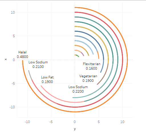
The last thing we have to do is put Region onto filters to filter by region. I started by filtering for Africa/Middle East, this is what you’re going to see after the filtering is done.

Now we have to format the worksheet with your desired colors and place the labels at the beginning of the rings.
To move the labels, click on Label on the “Mark” card, under “Label Appearance” click on the three “…“, once the “Edit Label” window opens up put the text on the same line and select Left to shift it to the left. Click Apply and OK
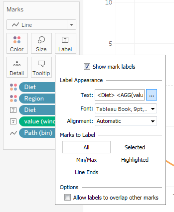
Then go to “Marks to Label” and select Line Ends. Deselect the last box; then go to “Alignment” and select Middle Left so the labels are centered along the start of the rings.

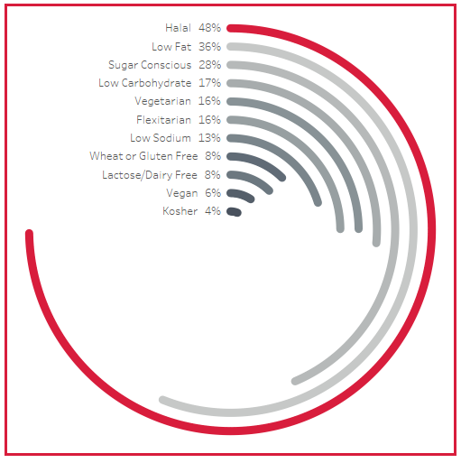
At this point your ring chart will look like this:
Now we can format the numbers, you will have to click on the drop-down for Window (Value SUM) and format the numbers to be percentages with no decimal places. You can also go back to the three “…” on the labels and bold the text so it can look like this:

Finally, we can to play with the colors!! I wanted to match the colors given on the Makeover Monday data source, where each region has a specific color. So, I made the top ring match the color of the region and made the other rings a gradient gray going from most (lightest) to least (darkest).
To do this the way I did it, or however you choose to go on the “Region, Diet” card and choose “Edit Colors…”

The “Edit Colors [Region, Diet]” window will pop up and from there you will have to first choose Gray from the “Select Color Palette” drop-down, once that’s selected just click on “Assign Palette”. Then to change the color on the biggest ring just double click on the first square under “Select Data Item”.

This will bring the “Select Color” window up, just choose your desired color and you’ll be done! I clicked “Pick Screen Colors” to get the specific color of each region from the Makeover Monday data source and added it to “Custom colors” but you can choose any color you want.

After your desired colors are chosen your chart for that specific region will be done!! Mine looks like this:
To get the border I just formatted the worksheet and selected “Format Borders”, scrolled down to Row Divider and Column Divider and choose a border with the color of the chosen Region from my custom colors.
Now your dashboard is almost done!! So Exciting!!! Just duplicate the worksheet for however many regions you have, filter for the specific Region and on each make sure you format the colors to whatever colors you want. When you put the worksheets on your dashboard, add the titles and format them to match the font and color chosen for each region. And most importantly, make sure you work on those tooltips, I didn’t want any tooltips on my dashboard so I just deleted everything from there. You can do it that way or uncheck where it says “Show tooltip” and it will do the trick!
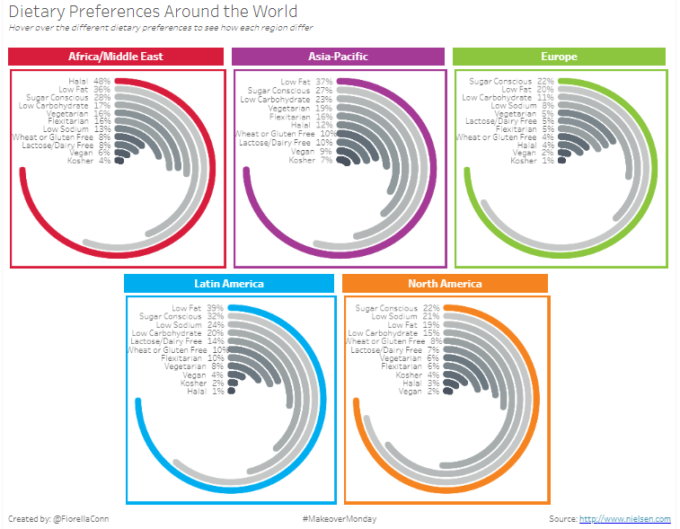
Tableau Tips Time!
- Always know your audience, in this case I wanted to keep the colors of the data source. I imagined that my dashboard was aimed to the source specifically and I wanted to show how the visualization could be improved. By keeping the same colors, I figured it would be easier to understand since those colors already represented the different Regions on the original design.
- Be conscious of ‘white space’ – ‘white space’ can be both good and bad. Sometimes we think that the more we put in a visualization the better it will be, but it will make your visualization cluttered and your audience won’t want to engage it if they are too overwhelmed with information. At the same time, too much ‘white space’ will take away from the attention of the audience and your message will not reach them.
- Keep it consistent – your font type and size need to be consistent with the rest of your visualization; this does not apply to the main title and subtitles, because you want to drag attention to them to first capture the audience. Multiple font types and sizes through your visualization is not really pleasing to the eye and it might cause confusion to the audience.
We hope you liked this post and as always if you have any questions let us know! Until next time!
Surf On and Keep Vizzin’!
The Data Surfers.
